

The Evolution of the Skin Care Line: A Story of Identity, Intention, and What Comes Next
There’s a moment in every creative journey when you stop, look at what you’ve built, and realize it’s time to shed an old skin so a new one can take shape. Sometimes that moment arrives gently. Sometimes it barges in uninvited, waving screenshots of search results that say, very loudly, “You’ve outgrown this name!”
That was the beginning of this chapter.
When I searched for my skin care line online and found other brands with nearly identical names overshadowing us, it hit me: the identity we started with no longer held the space we needed it to hold. “S.K. Skin Kare” had served its purpose, but it didn’t stand apart. It didn’t speak with the clarity or resonance the products deserved. And it certainly didn’t point back to the heart of Chimeric Creations, LLC, or the magic we’ve poured into every formula.
So here we are, standing in the middle of transformation—carefully, intentionally—deciding what this branch of business will look like as it steps into its next incarnation.
This isn’t a rushed decision. It’s an evolution.
And today, I want to show you the three paths this evolution might take.
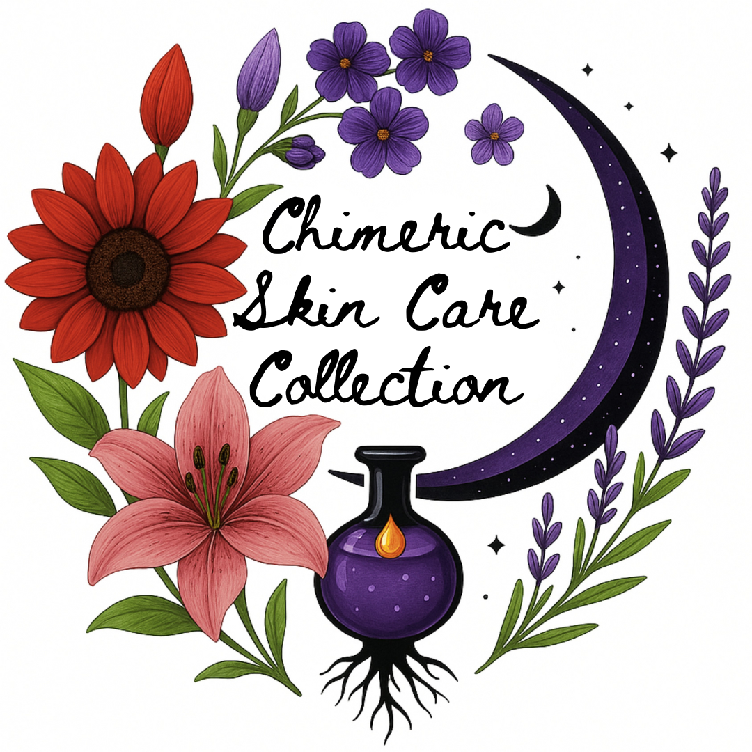
Logo Option One:
Chimeric Skin Care Collection
A Refined Return to Our Roots
The first design is familiar, but polished. A reimagining of the aesthetic we’ve been known for, with symbolism woven directly into every element.
The red sunflower and stargazer lily, the purple herbs all represent the two of us who built this line from scratch, our hands and hearts going into every batch. These flowers also speak to the natural ingredients we use, the botanical foundation of the formulas. The herbs encircling the design echo the healing traditions we draw inspiration from, and the crescent moon reminds us of cycles, change, and the quiet magic found in the everyday.
At the center sits the dropper bottle with a single drop of gold—our liquid gold—the ingredient that ties together our salve, lotion, lip balm, fragrance oils, and serum. The salve may be the star, but the whole line carries that same intention: accessible care, handcrafted with reverence, meant to live in real homes and real lives.
This logo honors where we came from while making space for where we’re going. The font may change before finalization, but the logo would remain the same.
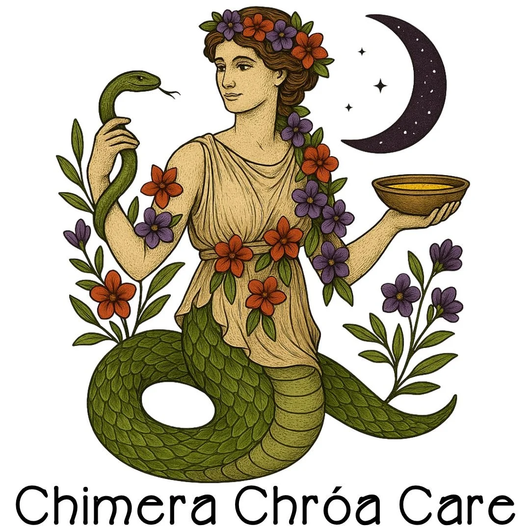
Logo Option Two:
Chimeric Chróa Care
The Hygieia-Inspired Vision
The second design tells a different story, drawing on ancient symbolism to express what this brand represents.
Hygieia, the goddess of cleanliness and care, holds a bowl in one hand, full of our liquid gold, and a serpent in the other. She is the daughter of Asclepius, god of healing, and Epione, the goddess who soothes pain. She is ritual. She is restoration. She is the embodiment of tending to the body with intention.
Our version of Hygieia carries botanical elements and flowers threaded through her hair and form, showing the natural world intertwined with the act of care. The crescent moon above her mirrors the celestial themes found throughout Chimeric Creations. Her presence feels both timeless and alive, grounding the brand in history while giving it a powerful narrative identity.
And while I can’t say anything the FDA would smite me for, Magic Cataplasm Salve does exactly what a daughter of healing and soothing would approve of. Enough said.
This direction feels mythic, elevated, symbolic, and unmistakably ours.
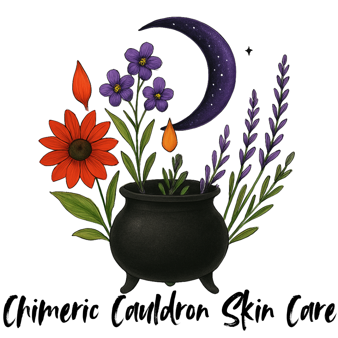
Logo Option Three:
Chimeric Cauldron Skin Care
A Brew of Tradition and Transformation
The third logo honors aspects of the old design but reframes them through a more elemental lens.
The cauldron represents creation—the literal brewing of our oils, herbs, waxes, and botanical infusions that become our products. The flowers rising from it mirror the ingredients we use. The crescent moon arcs overhead, dropping a single golden bead of into the mixture. That drop is the same golden ingredient we treasure, the one that gives Magic Cataplasm and its companion products their glow.
This logo is earthy, witchy, rooted, and deeply connected to the handmade nature of our line. It feels like a visual doorway into our creative process without revealing a single ingredient or production detail. It hints at the alchemy without explaining the recipe.
It’s both familiar and fresh. Again, the font would change before finalization.
Why This Rebrand Matters
This isn’t just a cosmetic makeover. It’s a step toward clarity, growth, and longevity.
When we first launched the skin care line, it was a side branch of Chimeric Creations. Now it’s a major limb with nationwide potential. I can see us becoming a household name. I can see Magic Cataplasm sitting on shelves in pharmacies and dispensaries. I can see people reaching for it the same way they reach for polysporin-type products—something trustworthy, something dependable, something they keep in arm’s reach because it works for them.
To reach that future, the identity has to match the vision.
That means choosing a name that stands apart. A logo that resonates. A story that carries.
And at the center of all of it remains our driving belief: Magic Cataplasm Salve belongs in as many homes as possible. We believe in what it brings to the people who use it. We believe in making it accessible, which is why we keep its cost as low as possible. The rest of the line is wonderful—lotion, lip balm, fragrance oils, serum—but the salve is the heart.
This rebrand is about honoring that heart.
A Personal Note From the Creators
This journey has forced us to get brutally honest with ourselves about what we’re building and why.
We’re small-business owners. Two moms. Two disabled creators. We’ve built every part of this brand with our own hands—formulating, testing, designing, refining, adjusting, and reenvisioning. When someone chooses our products over the faceless industrial giants, they’re choosing more than a tin or a bottle.
They’re choosing story. Care. Craft. Humanity.
We want people who bring our products into their homes to feel comfort, trust, magic, empowerment, and that sense of accessible everyday ritual. We want them to know exactly who they’re supporting and feel good about it.
This rebrand is the next step toward showing that clearly.
What Happens Next
We’re getting new labels for everything after the first of the year, so now’s the time to act. This is your last chance to grab current products before they’re refreshed and the whole line transforms. Until then, we’re inviting you into the decision-making process.
Because this new identity isn’t just about us. It’s about the people who love this line, use it, share it, and keep it alive.
Vote on Instagram + Join the Mailing List
The official reveal is coming soon, but right now?
You decide the direction.
We want you to go vote on the Instagram poll like your favorite product’s future depends on it. We want you to join the mailing list below so you’re the first to know which name and logo wins. And we want you to be part of this next chapter with us—because you’ve gotten us this far.
This brand is growing. Evolving. Becoming clearer and stronger and more intentional every day.
And your voice matters in the transformation.